
Realizing the Problem
This project began because I noticed a disturbing pattern in our operations. Critical escalations and RMAs were getting lost. Customer Service would flag an issue, Engineering would promise to "look into it," and then it would often be forgotten about among other tasks.
I observed a palpable tension in the office:
Customer Service
Operated on Short-Term Urgency: Fix this customer's water valve now.
Engineering
Operated on Long-Term Stability: Stop bothering me so I can build the next version.
I realized that our tooling was exacerbating this divide. The lack of a shared, visible workflow meant there was no accountability. I pitched this redesign not just as a UI refresh, but as a necessary bridge to align these conflicting department goals.

My Approach
I utilized the Double Diamond process to ensure we solved the root cause, not just the symptoms.
Discover & Define
Discovery: The "5-Window" Struggle
I shadowed the CS team and found their workflow was fragmented across five different screens: Freshdesk, Shopify, Teams, Spreadsheets, and the legacy AdminTool. This fragmentation meant that when an engineer did try to help, they had to hunt for data, increasing their frustration.
Heatmap analysis revealing the most critical features and neglected areas
Discover & Define (continued)
The Audit: The Failure of Linear Navigation
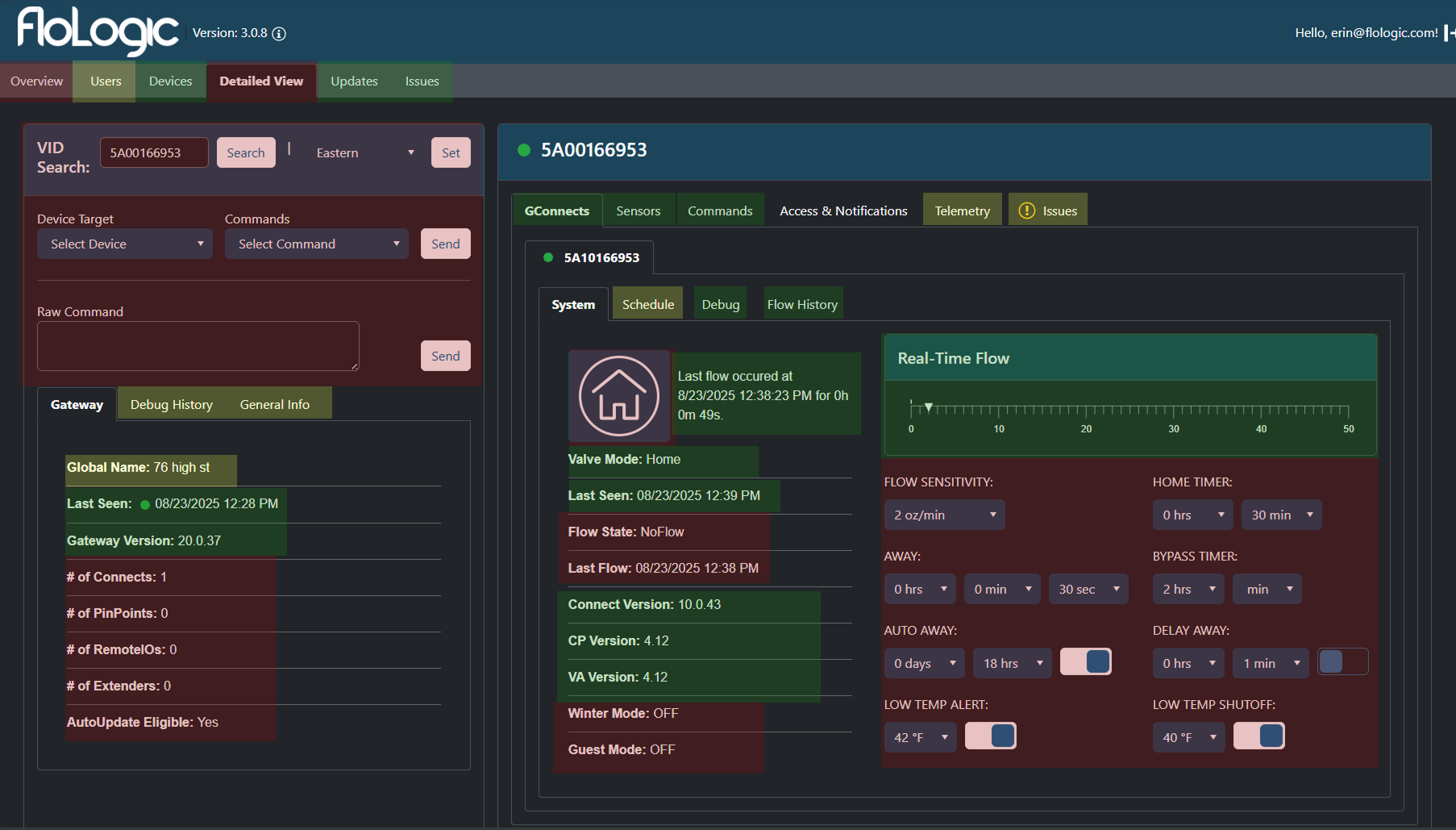
The existing AdminTool failed not because it had too much data, but because it forced a linear workflow on a non-linear problem.
Support agents and Engineers need High Information Density. To troubleshoot a complex hydraulic system, you need to see the Flow Rate, the Valve Status, and the Recent Commands simultaneously to identify correlations.

Critical Failures
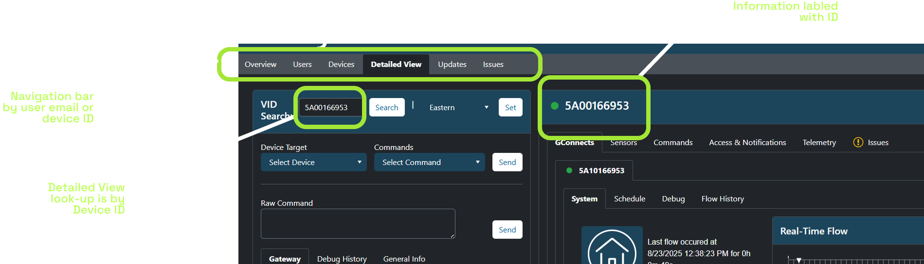
- The "Tab Tax" (Information Siloing): The architecture relied on deep, nested tabbing. To see "Flow History," an agent had to click Device > Detailed View > GConnect > Flow History. If they needed to cross-reference that history against "Sensor Readings," they had to click away, effectively blinding themselves to the first piece of data.
- Inability to Correlate: You cannot diagnose a system if you can't compare cause and effect side-by-side. The tabbing structure turned troubleshooting into a memory game.
- Visual Noise: While we needed density, the old UI suffered from "chartjunk"—excessive grid lines and heavy container borders took up valuable pixel real estate that should have been used for data.
- User Flows: Any time CS had to leave the tool mid-flow, information scatterred and there was no guarentee it would make it to Engineering
- Leaving Admintool to search warranty history
- Leaving to look up past tickets or conversation threads
- Leaving to check procedural steps or reference material(excel sheets)
- Leaving to ping engineering directly in Teams for missing context
Definition: The Model Mismatch
I defined the core friction point: The internal tool was lagging behind the product reality.
Our customer-facing mobile app had already been restructured to serve a Location-Based Model (allowing users to manage multiple properties like "Lake House" vs. "Main Home"). However, the internal AdminTool was still architected around raw Device IDs.
This created a constant translation layer:
- Customer calls about "The Lake House."
- CS Agent has to find the ID for "Lake House."
- CS Agent inputs ID to find data.
It was only natural that the CS tools should mimic the customer-facing structure, yet they were completely out of sync.
Develop (Exploring Approaches)
I explored three distinct strategic avenues to solve the fragmentation issue.
Approach A: The "Freshdesk Widget" Strategy
The Concept: Build custom widgets inside Freshdesk so agents never leave the ticket view.
Why rejected: It solved the CS problem but ignored Engineering. Engineers needed a robust debugging environment that could also assist with tracking.
Approach B: The "Kill Freshdesk" Strategy (The All-In-One)
The Concept: Expand the AdminTool to become a full CRM, handling email threading and ticketing so we could cancel our Freshdesk subscription and have truly "One Tool."
Why rejected: Scope Creep. We realized that rebuilding standard ticketing features (email parsing, SLA tracking, rich text editors) was a massive waste of engineering time. We needed to solve FloLogic-specific problems, not rebuild a generic helpdesk platform.
Approach C: The "Deep Integration" (Selected)
The Concept: Keep Freshdesk for communication, but pull its data into AdminTool via API. AdminTool becomes the "Command Center" where work happens, while Freshdesk runs quietly in the background.
Why chosen: It allowed us to leverage Freshdesk's email capabilities while giving us the flexibility to build a custom, location-based engineering dashboard.
Deliver (The Solution)
We deployed four core solutions to consolidate the workflow and enforce accountability.
1. The "Intelligent Ingest" (Solving the 5-to-1 Workflow)
We built an Azure Python function that acts as the bridge between Freshdesk and AdminTool.
- The Trigger: Whenever a CS agent initializes a new issue for a location in AdminTool, the system calls the Azure function.
- The Action: It runs the "Inference Chain"—scraping the Freshdesk ticket, cross-referencing it with the device's technical stats, and extracting the relevant engineering data.
- The Result: The issue form is pre-filled with a technical summary before the agent even starts typing.
Engineering's POV: Engineering-relevant Context
- System State: Gateway Online (LEDs confirmed Green).
- Symptom: GConnect Pairing Failure (Timeout).
- Context: Fresh Install (0 hours runtime).
- History: No previous successful handshake (Never Paired).
- Inference: Likely radio interference or stuck in Factory Mode.
2. Visual Hierarchy & "Location" Alignment
We restructured the dashboard to match the customer-facing reality.
- Location-Centric: The header displays the address/customer name, not just a Device ID.
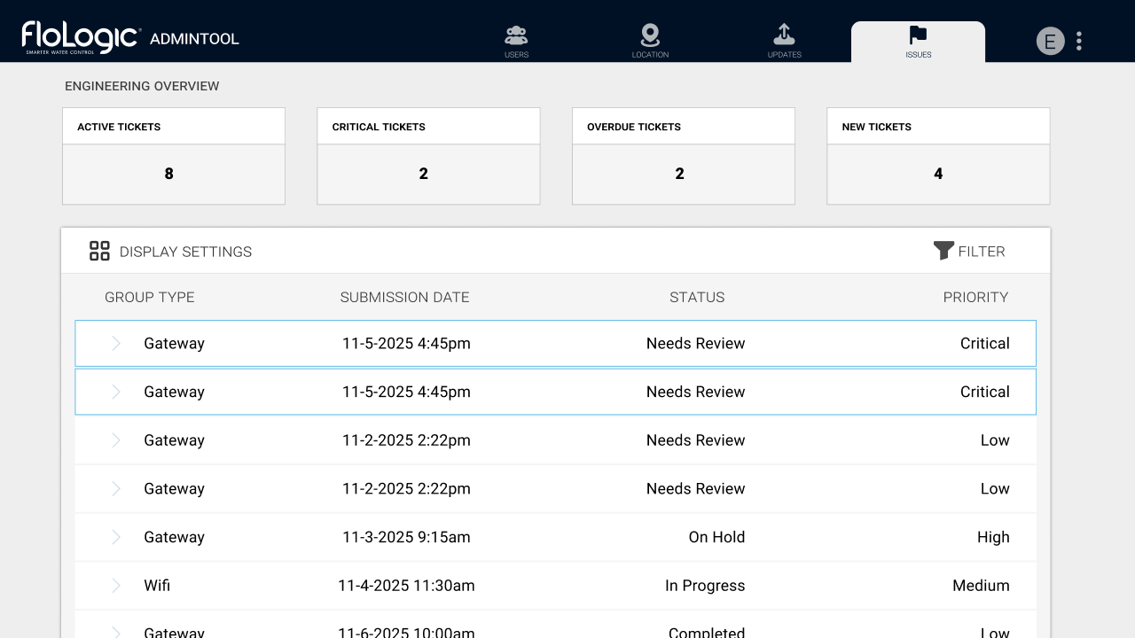
- Maximized Density: We killed the "Tab Tax." Using a multi-column layout, we surfaced System Status, Ticket History, and Warranty Info simultaneously. Agents can now correlate device telemetry with a "Valve Mode Change" without clicking through tabs.
Note: Images showing the new location-based labels and navigation are represented in the solution visuals below.
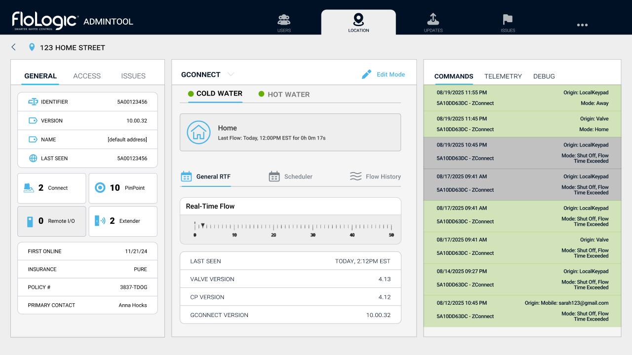
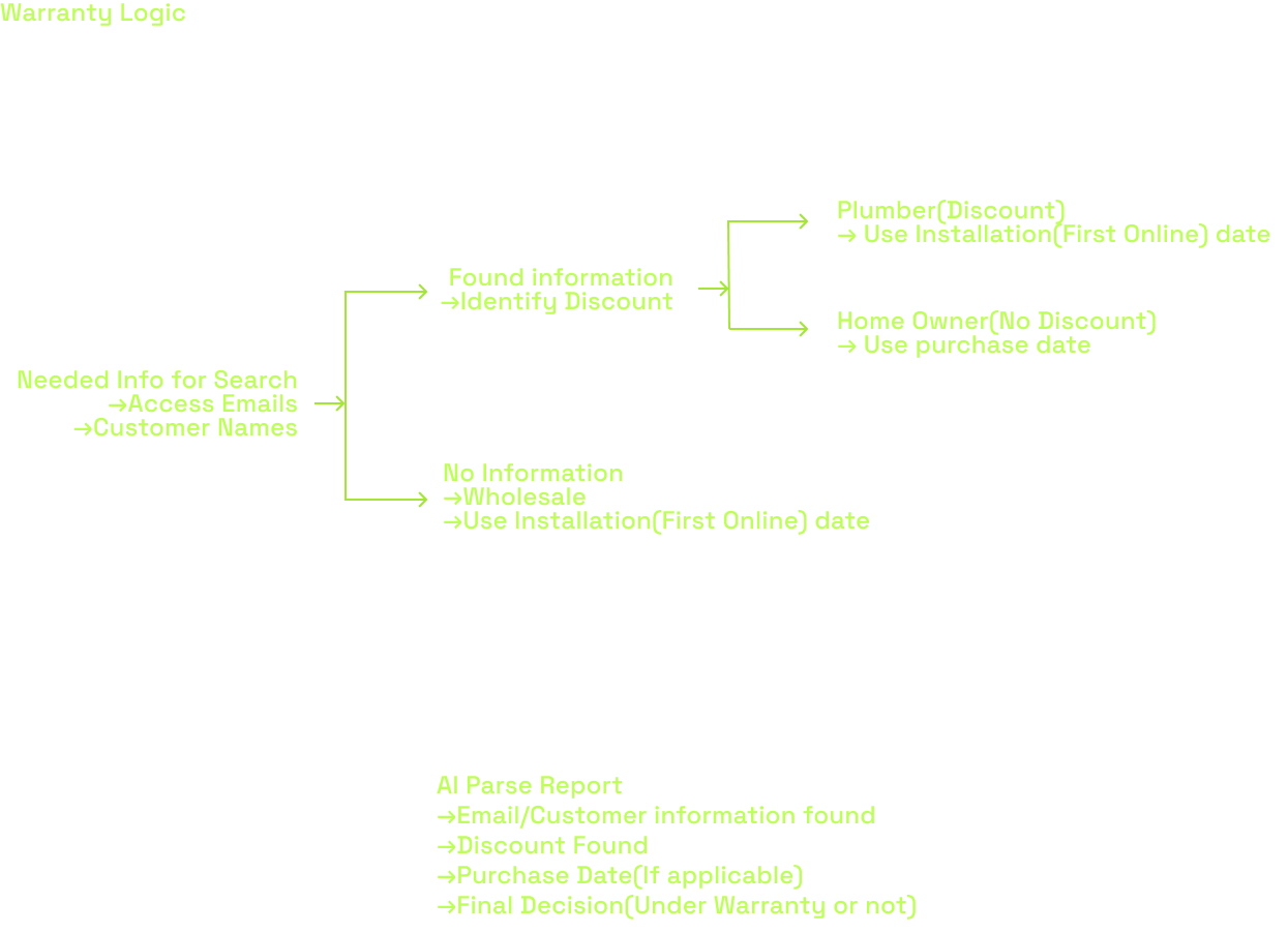
3. Automated Commerce Logic
We integrated the e-commerce layer to speed up hardware replacements.
- Automated Warranty Check: The system now pulls purchase dates from WooCommerce to auto-calculate warranty status based on user type.
- One-Touch PO Generation: If a part needs replacement, the agent clicks one button. The system opens a Shopify tab with the Purchase Order pre-filled (Customer Name, Address, Email, SKU).
4. The Engineering Command Center (With Scarcity Logic)
To solve the "Black Hole" issue while preventing spam, I designed a constrained priority system.
- Prioritized Queue: Engineers see a list of escalated tickets, sorted by urgency.
- The Behavioral Shift: This forced the CS team to self-police. If they wanted to escalate a new issue, they first had to de-escalate or resolve an existing critical one. This ensured that when an engineer received a "Critical" alert, it was genuinely an emergency.
Development Challenges
Before arriving at the final state, we encountered significant implementation roadblocks regarding both Technology and Human Behavior.
1. The AI Context Gap: Teaching "Inference," Not Just Summary
The biggest technical hurdle was teaching the AI to recognize technical causality.
The Problem: A customer might say, "I haven't seen flow readings in 3 weeks." Initially, the AI would report that verbatim, or minus any story/emotional context.
The Complexity: To an engineer, that sentence implies a specific investigation chain. We realized the AI needed to act as a diagnostician. It needed to take that symptom ("No Flow") and immediately look for specific context markers: Was the sensor replaced? Is the firmware on v3.95? Is the WiFi unit on v2.4.5?
The Fix: We trained the model to understand that IF those conditions are met, THEN the issue is likely a "Microsoft Certificate Update." We had to feed the AI these specific technical parameters so it knew which data points were relevant to present to the engineer.
2. The "Boy Who Cried Wolf" Risk
We gave CS the ability to flag tickets as "Critical" to alert engineering. However, during testing, we realized there was a massive risk of alert fatigue. If CS marked every difficult ticket as "Critical" to get a faster response, Engineering would eventually mute the notifications, and the system would fail. We needed a way to force prioritization.
The Scarcity Cap: To prevent the "Boy Who Cried Wolf" scenario, we implemented a hard limit: Only 2 tickets can be marked "Critical" at any one time.
3. Strategic Deployment: The Phased Rollout
I identified a significant risk: Change Fatigue. We were asking the team to fundamentally change their Mental Model (from Device ID to Location Address). If we also completely overhauled the Visual UI (buttons, colors, layout) at the exact same time, the cognitive shock would be too high. The tool would feel "entirely new," leading to resistance.
We opted for a Phased Approach:
- Phase 1 (Structural): Implement the new "Location-Based" architecture and search logic, but keep the UI components and general "feel" familiar. This allowed CS to adjust to the new workflow without fighting their muscle memory.
- Phase 2 (Visual): Once the structure was accepted, we rolled out the high-density visual cleanup and the transition from Dark Mode to Light Mode.
Outcomes & Retrospective
The Results
Key Outcomes:
- Consolidated Workflow: Reduced active toolset from 5 windows to 1. CS can now troubleshoot and escalate without context switching.
- Engineering Focus: Reduced ad-hoc interruptions by 80%.
- Scalability: The Telerik design system I built was adopted across the Insurance and User Dashboards.
Before
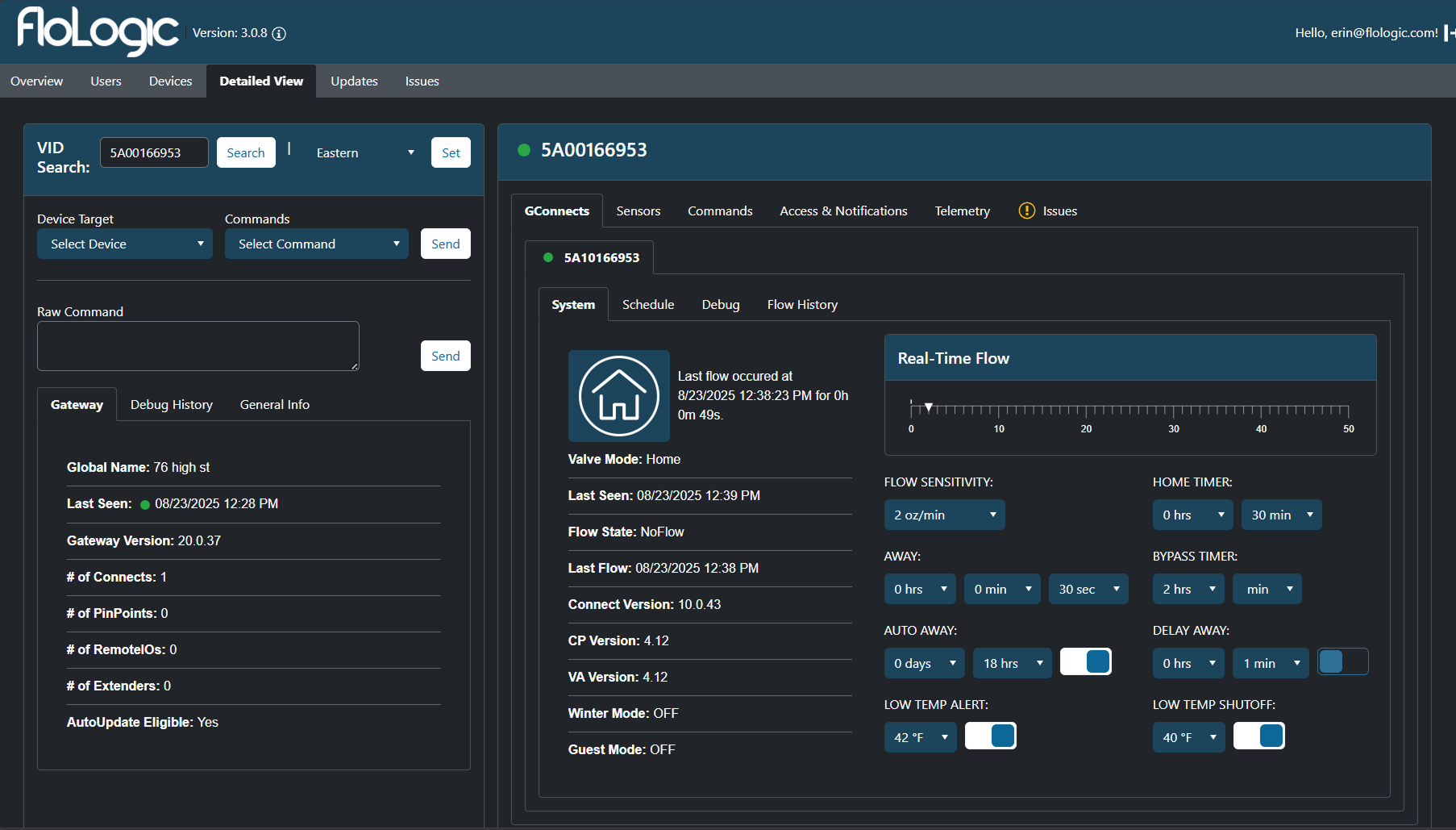
After

Deep Retrospective: The "Minimalism" Trap
Going into this, I carried a standard B2C design bias: "Reduce Cognitive Load by hiding things." I initially tried to clean up the interface by tucking telemetry data inside accordions and distinct tabs. This failed hard.
The Key Insight
I learned that for expert users (like Engineers and specialized Support), Clutter is a failure of layout, not volume. These users didn't want "cleanliness"; they wanted Data Density. They needed to see the Valve Status, Flow Rate, and Last Command at the exact same time to make a diagnosis.
My definition of "Good UX" shifted from Simplification (removing elements) to Orchestration (arranging high volumes of data so it is scannable).
