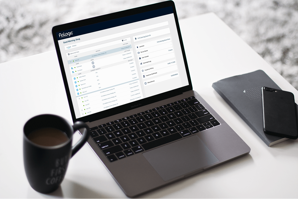
From Consumer to Commercial
When FloLogic expanded from consumer homes into commercial properties, our sales team needed something fast: a working MVP dashboard that made sense to property managers - not just engineers. I stepped in as the lead product designer to ship a clean, no-fluff user interface that brought value from day one.
The Ask: "We just need something to show"
FloLogic's sales team was moving fast. With new B2B partnerships forming, we needed a working dashboard to demo - one that let stakeholders visualize devices across multiple properties without confusing or overwhelming them.
The Challenge
- No prior web dashboard existed
- Needed MVP-level scope - fast
- Minimal backend flexibility (MAUI - Telerik)
- Needed to work for both B2B and individual property managers
- Data was device-heavy, but context-light
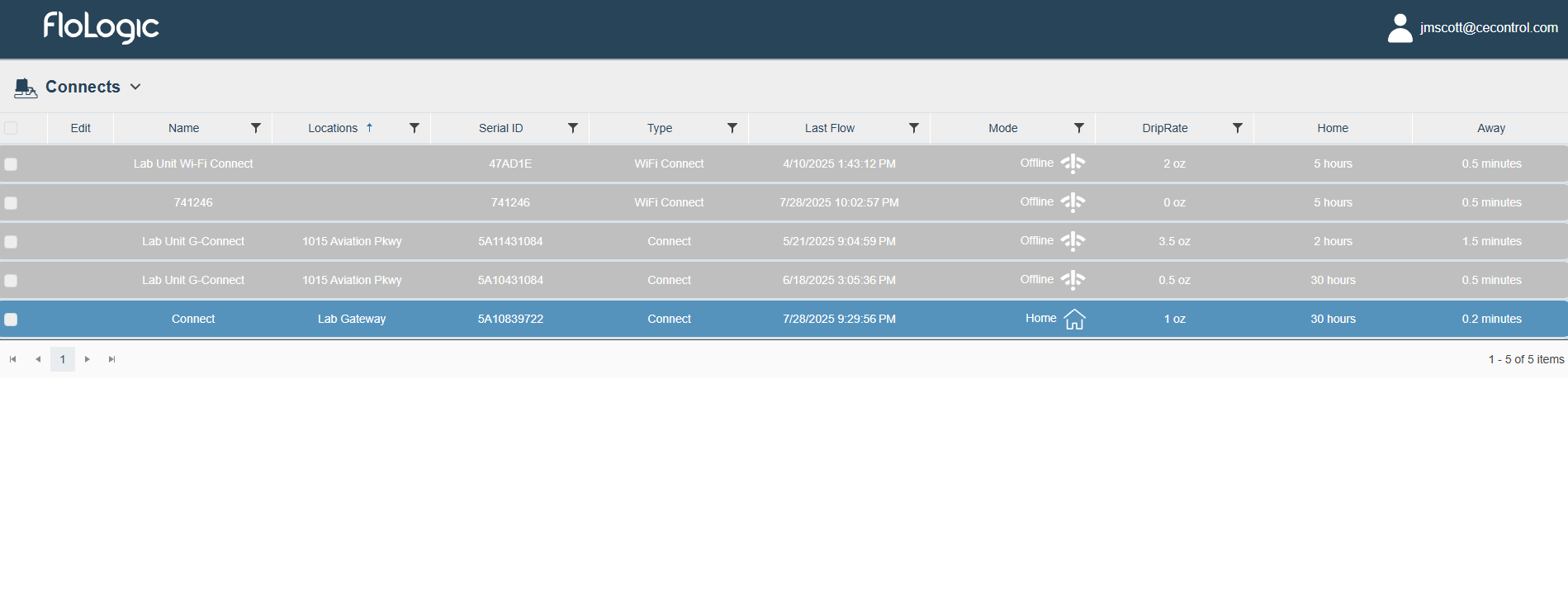
The Problem: Early Designs Confused Users
Early designs confused beta users and stakeholders with feedback like:
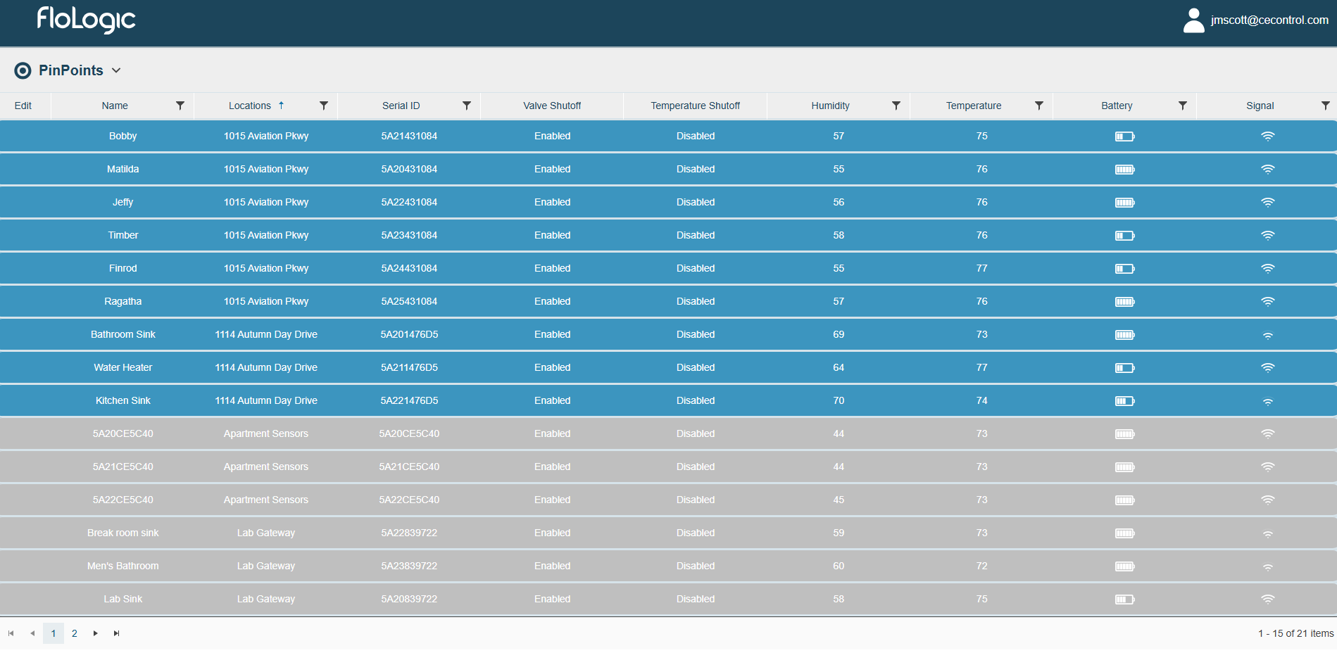
"Why are the PinPoints separated out?"
"Where is my Wi-Fi Connect?"
While it worked for internal testers who already understood the system, new users hit a wall trying to find even basic device info.
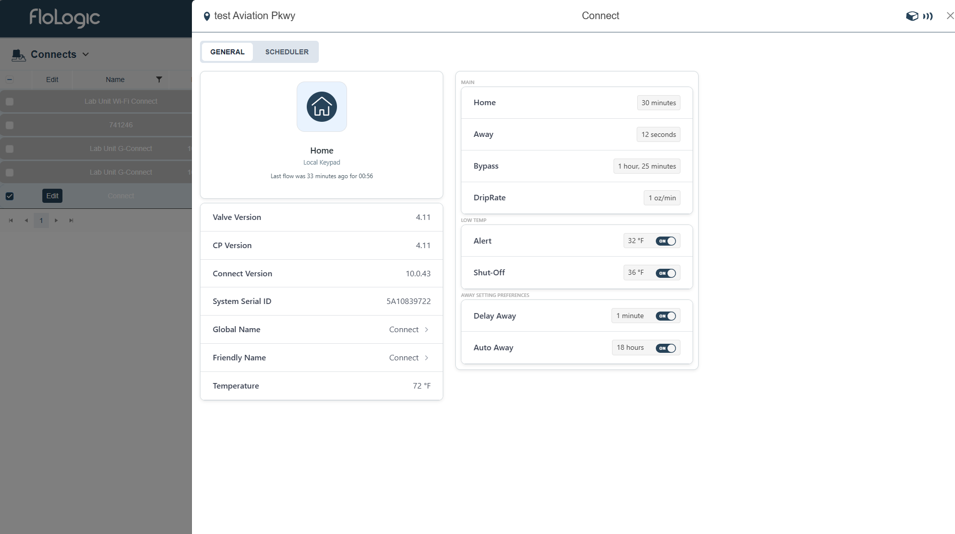
What They Originally Had
Before my involvement, the "dashboard" was clunky, but workable. This is the design they were working with:

What I Built Instead
Key Changes Made:
🏢 Clear Property-Level Hierarchy
Grouped gateways, valves, and sensors by property for intuitive navigation
📱 Dedicated Information Sections
Removed confusing slide-outs and gave information its own designated section
⚙️ Clear Grouping & Customization
More intuitive dashboard customization with logical device groupings
Dashboard Walkthrough
Interactive walkthrough of the new dashboard features and navigation
New Dashboard Design
The transformation from the original design to the new dashboard demonstrates a fundamental shift in approach: from device-centric complexity to location-based clarity.
Before

After
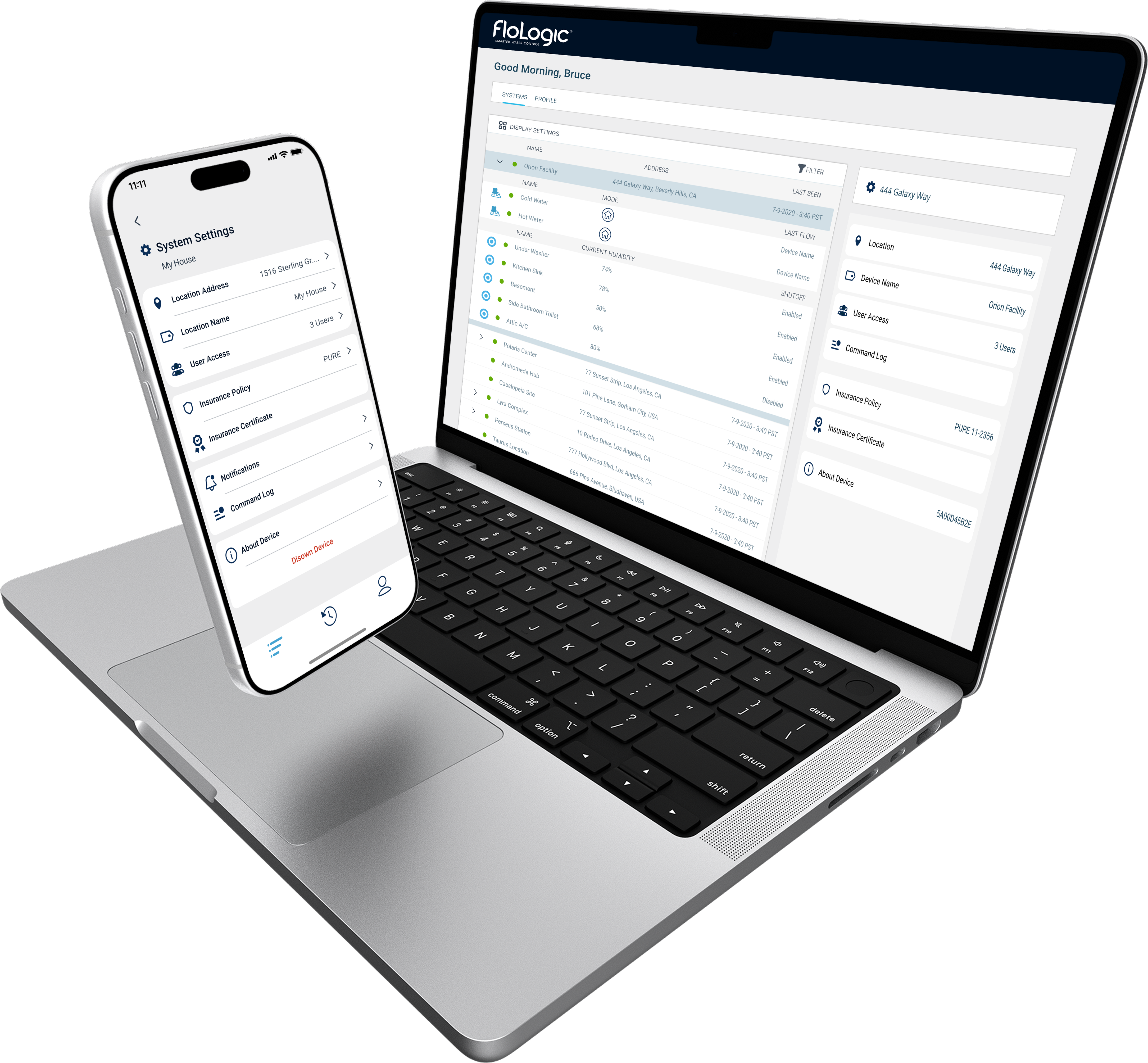
Design System Integration
This dashboard was an extension of the FloLogic mobile app, so visual consistency was paramount. The settings interface needed to mirror the app's design language to create a seamless experience across platforms.
The project adopted the pre-established design system from the AdminTool project, utilizing Telerik frontend components adjusted visually for backend-heavy dev teams. This plug-and-play approach allowed engineers to implement the design quickly while maintaining the high-quality visual standards established across all FloLogic products.

The final MVP dashboard: clear, purposeful, and ready for B2B demos
