Why
FloLogic is a physical leak detection device previously relying on a singular Wi-Fi-based system to communicate shutoffs and water use information to an end user's app.
With the integration of a new device family, they expanded their reach with water sensors, alarm and irrigation system integrations, all operating through a mesh network in the home.
The Core Question
How do we integrate this in so the same concept is conveyed to the end user, just with additional functionality?
What I Did
1. Complete App Re-work + Modernization
Tore the legacy linear flow apart and rebuilt it around a clean tab bar, location-centric device tree, and sleek Apple-inspired settings pages. Prototyped, user-tested, and shipped the new flows with devs (TestFlight every Friday). Helped engineering stand up new APIs for multi-property support and real-time sensor feeds. Rolled out inline troubleshooting and contextual help so users solve 90% of issues without calling support.
Result: 50% fewer taps to reach valve controls, 25% drop in support calls within beta cohort.
2. Comprehensive Design System + Brand Guidelines
Tokenized color, type, spacing, radius, opacity – delivered both primitive and semantic tokens so devs could ramp up fast. Built a starter component library (valve cards, alert chips, status pills, etc.) and coded Figma → Storybook hand-off docs. Co-authored the first brand guidelines doc with another designer: tone, imagery, and motion rules so marketing, support, and app feel like one product.
Why? Dev handoff became plug-and-play. Instead of "pick any blue," engineers grabbed primary-600, shipped, done. Felt like stapling success into FloLogic's near future, not just polishing one flow.
3. Beta Feedback Integration
Ran a 20-person beta (plumbers, retirees, property managers). Weekly surveys, guided Zoom walkthroughs, and "record your screen" tasks. Logged every friction point in Airtable, tagged by severity, pushed high-impact items straight to the sprint board. Closed the loop: emailed testers release notes and asked, "Did this fix it?"
Why? Real houses, real water leaks. Lab tests can't mimic a crawl space router. Early truth bombs saved months of re-work.
4. Stakeholder Presentations on Hi-Fi Prototypes
Hosted live Figma walkthroughs with CEO, hardware lead, support manager. Encouraged them to "break it" – every question captured in a running decision log. Used their feedback to kill scope creep and keep design debt visible before dev sprint planning.
Why? With a vocal bunch that wants everything and nothing, regular show-and-tell kept me on the right path and surfaced blockers fast.
5. Project + Cross-Team Management
Daily Slack stand-ups with devs, weekly sync with customer support, bi-weekly demo for execs. Published timeline in Notion – clear dates for design freeze, dev handoff, QA, and TestFlight. Acted as the glue between hardware quirks, marketing asks, and user pain points.
New System
The transformation wasn't just about adding features - it required fundamentally rethinking how devices connect, communicate, and are controlled:
Simple & Direct
One standalone device connected directly to Wi-Fi, controlling the home's main water shutoff.
Modular & Nested
- Thread-connected valves
- Environmental sensors
- Dry-contact triggers
Legacy Failure
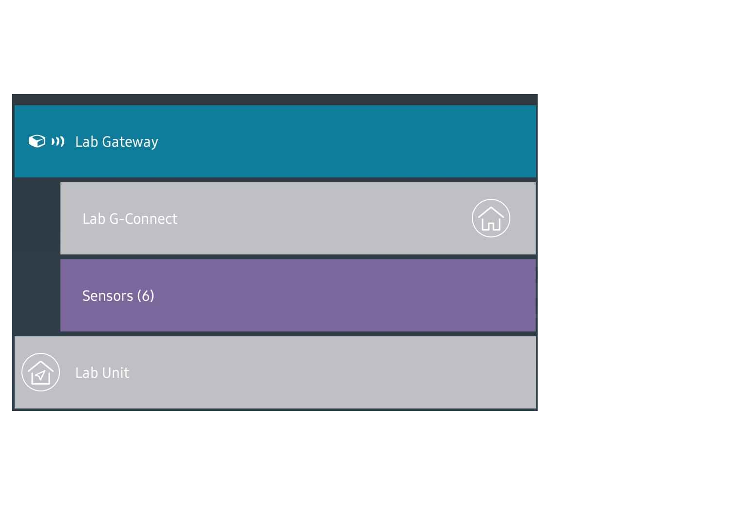
The original UI was elegantly simple - because it only had to handle one scenario. But when we introduced the ecosystem approach, that simplicity became a liability:
Critical Gaps in the Legacy Model
- No concept of device hierarchy: Couldn't show parent/child relationships between Gateways and devices.
- Every device assumed direct control: No model for "monitoring-only" devices like Gateways or Extenders.
- Mesh network dependencies invisible: Users couldn't understand why Device A affected Device B.
- Inconsistent notification patterns: Different device types needed different alert and status displays.
- Settings complexity explosion: Each new device type required branching settings logic.

The Initial (Naive) Solution
Our first instinct was to maintain visual consistency - make legacy Wi-Fi valves and new GConnect valves look identical in the interface. The thinking was that users would intuitively understand they offered the same control features, despite the new system's hierarchy.
Spoiler alert: This approach completely failed in beta testing.
Location Based
The Mental Model Shift
Device-Type Framing
"You have a GConnect valve, a Legacy valve, a Gateway, and sensors..."
Location-Based Framing
"This is your house. These are the devices protecting it."
The Results

- Logical grouping achieved: Settings, controls, and alerts felt navigable rather than abstract.
- Bridge between legacy and new: Users could understand their system layout without decoding technical hierarchy.
- Beta testing success: Significant improvement in user comprehension and task completion.
Other Failures
1. Navigation Structure
The app's navigation is highly linear, which limits flexibility when switching between devices. As more device types are added, this structure becomes increasingly inefficient. The amount of clicks it takes to get to one crumble of information is extremely diluting. With Miller's Law in mind, cross-referencing information would be nearly impossible.
2. Overly Novel
FloLogic often introduces new and unfamiliar ideas across their brand, from the language they use to past design choices and the overall user experience with the physical product. The app design alone can make the experience feel unfamiliar or harder to navigate. Following established patterns (Jakob's Law), would help users feel more grounded and confident as they move through the app.

3. Recognition Over Recall
The current layout forces users to remember where certain settings or features are located instead of making them easily visible. For example, notifications are buried within individual device settings. With the expected addition of high-volume devices like PinPoints, a centralized notification center would improve accessibility.
4. Error Prevention and Help
The app provides limited support for preventing user errors, offering recovery steps, or guiding users through in-app assistance. The FloLogic support team is extremely overwhelmed with the amount of troubleshooting calls they get per day, and the app's support is non-existent.

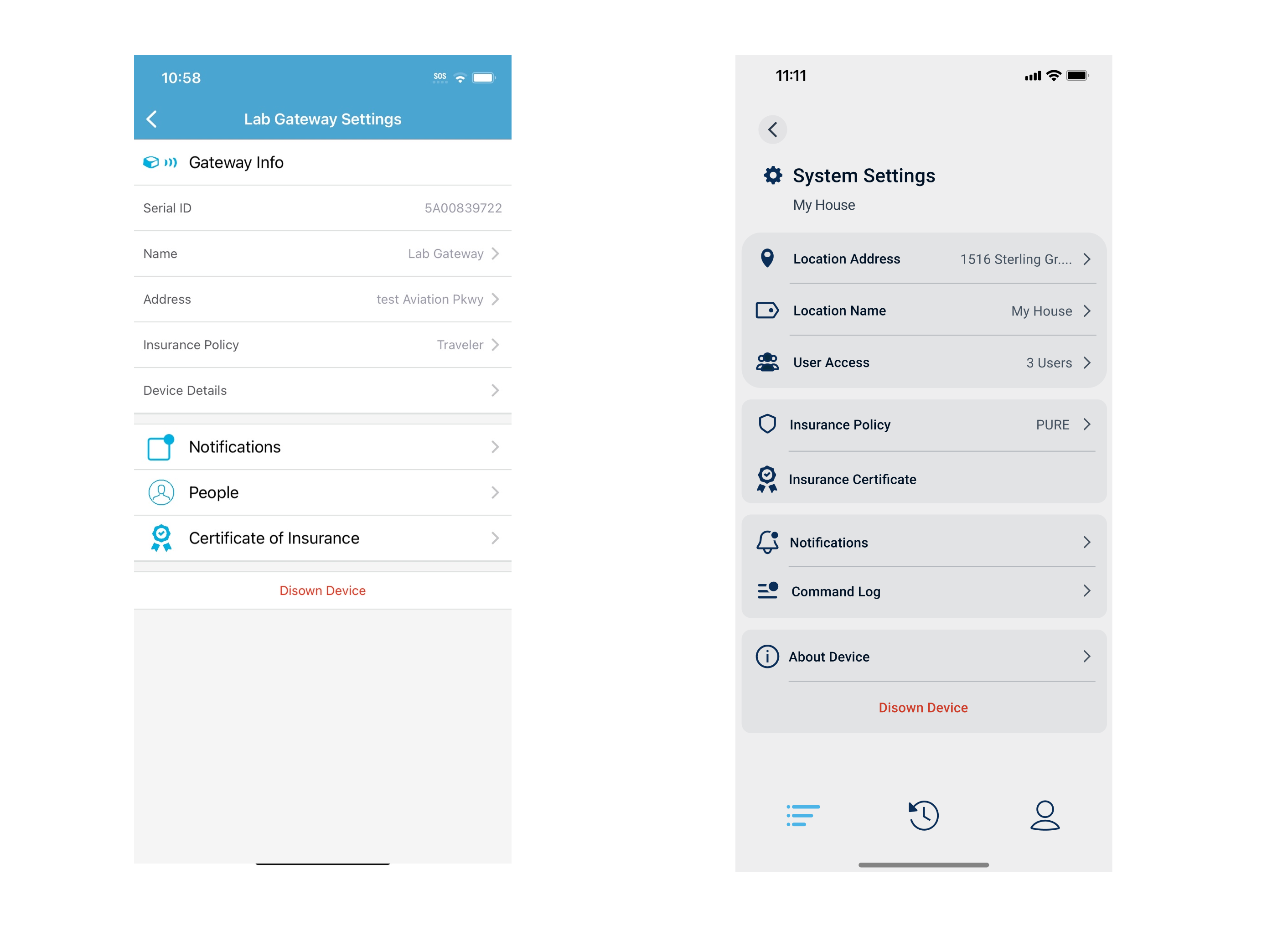
Gateway settings comparison showing the dramatic improvement in design and usability
Settings
This one is my personal favorite out of all of them. The FloLogic brand really appreciates Apple's sleek look so I took inspiration from that design. I continued with functionality from the device tree and put it into the valve settings. I cleaned up a lot of loose ends with this part of the project.
Many of these settings you had to dig for but the new design groups like-settings and makes it far more readable.
Implementing the same functionality in the device tree to keep things consistent while giving users access to the settings they care about the most. This is also where I was able to add little information icons to allow the user to understand FloLogic lingo.
Before: Legacy Settings
Cluttered interface with poor information hierarchy and confusing navigation patterns.
After: Redesigned Settings
Clean, Apple-inspired design with logical grouping and intuitive user flow.
Additional Work
To reduce support burden and empower customers to resolve issues independently, I created an interactive LED and button troubleshooting guide for FloLogic's website.
This comprehensive resource walks customers through common device states, LED patterns, and button interactions, helping them understand and resolve issues without needing to call support.
Continuous Evolution
The current version of the FloLogic application is live in beta and continues to evolve with each new device firmware release and user feedback. The main change with the device hierarchy exists in production. FloLogic plans on slowly rolling out these changes over time as the dev team is able to implement them.
Lessons Learned
Looking back, this project was a complex systems challenge disguised as a UI update. Several key learnings emerged:
Low-fidelity prototypes: I would use more low-fidelity prototypes in the future (now that I have a design system), creating these would be quicker and communicate a concept without completely going balls to the wall with high fidelity just to have it shot down. In the end it's just a time saver.
Decision log: Keep a decision log for stakeholders. One running doc that records "what we decided and why" prevents repeat debates and speeds approvals on future iterations.
Version control: Version the design system. Tag each major change (v1.0, v1.1) so devs know which token set to pull. It prevents "mystery overrides" when multiple teams ship in parallel.

